RSS
 

Archive for the ‘Design’ Category

Mushroom Life Simulator

24 Sep 2006

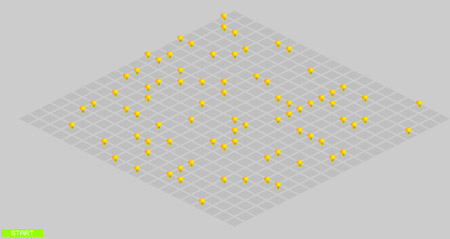
This is a very cool piece of Code-Art to check out: there’s a 20 by 20 squared field set up. You have to make contours (figures) in the squares by clicking on them. Doing so, you ’seed’ mushrooms. Make sure you seed plenty so it looks like the first screenshot I took. Then press the ‘generation’ button to start. You’ll see the formula start to work and ‘calculate’ generations, showing the results instantly (as illustrated in the second image below)

Mushroom Seeding Field

Resulting process in action:

Mushroom Process Results

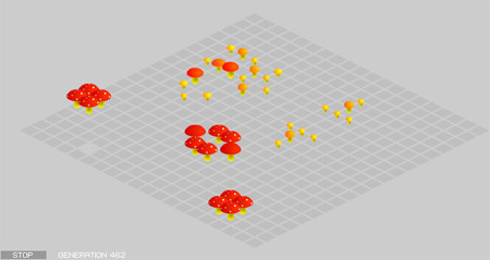
When it’s all finished, or if you can’t wait that long: earlier, you can start clicking randomly in the field (click fast in circular movements) to activate new generations of mushrooms.

Mushrooms follow these rules:
For each generation,
a mushroom with 1 or 0 neighbor dies (loneliness),
a mushroom with 4 or more neighbors dies (overcrowding),
a mushroom with 2 or 3 neighbors survives (stability),
an empty space with 3 neighbors sprouts a new mushroom (birth).

Check out:
Art Project: Mushroom Life
by Kaiyijo
A Mushroom perspective on John Conway’s Game of Life

Also check out Kaiyijo’s site, by the way. It’s a Flash beauty!


Belgian Fries

14 Sep 2006

I’ve always wondered why they call it French fries, while in fact Belgium is the only land that knows how to make decent fries. I’ll try to never call it French fries again. Just out of patriotism. Late November our culinary pride will be put on display again in the national ‘week of the fry’, and this time it’s all about the wrapping. The VLAM (Vlaams Centrum voor Agro- en Visserijmarketing, which is the Flemish Center for Agroculture and Fishery Marketing) organises a competition for graphical designers who can think of an entertaining and new look for the typical cone in which the fries are served. The designs of the 15 finalists will be giantized and 3D-ized in real life and exhibited in open air. (So I bet they’ll not scale it in paper or cardboard). The eventual winner will go home with € 500 ($ 635). Godfather of the campaign is Herr Seele, creator of the Flemish urban cartoon hero ‘Cowboy Henk’. Herr Seele kicked off the campaign with a design of his own to set the mood. The competition is open for pros, artists and students so if one of these three descriptions suit you: feel free to participate. All you have to do is be creative with the cone (in a graphical way – putting it on your head and sending a picture of that is funny, but will not help)

Herr Seele

Copy: “Will you become king of the cone?”

Info on the theme site | Download technical drawing

Specs: height: 115 cm | diameter: 60 cm | upper contour: 160 cm

This competition is a joint venture of the VLAM and the Flemish ‘friturists’ (owners of the fry-shacks) and the potato-peeling companies.
(And no, I’m not making this up)

Client: VLAM
Agency: Germaine
Artdirector: Bart Klerckx @ Republica
Copywriters: Eric Debaene, Geerard Van de Walle
Photographer: Luk Monsaert
Thanks, Bart


Website DNA

07 Aug 2006

Cool toy. Nice graphics. Don’t know if it has any other purpose besides being artistic and all that, but it visualizes quite good how ’semantic’ your website in fact is.

Web 2 DNA

What it means:

The brightness of the lines is determined by the importance of the tags in terms of structure.

  • H1 is brighter than H2, which is brighter than H3.
  • TABLE is brighter than TR, which is brighter than TD tags.
  • Images and flash elements appear as 70% white.
  • New HTML tags like STRONG and EM is brighter than older ones like B and I
  • UL, OL and DL is brighter than their LI, DT, DD
  • DIV layout is brighter than table layout

Basically a semantically rich site will appear brighter than one with messy old-style code.

WEB 2 DNA via zog | 7seconden


Ford In Ice

05 Aug 2006

It’s been a bit longer than a year since I first wrote about a promotional stunt for a car brand where they’ve cut an entire model of out ice. Well, about one later they’ve done it again. Different brand though, and still pretty impressive to see. To celebrate the success of the Ford Focus – the UK’s most popular car – Roelant de Waard, the chairman and managing director of Ford Britain, revealed a life-size six-and-a-half-ton ice-sculpture of the new Ford Focus Coupé-Cabriolet last month at a fair in the UK.

Ford Focus in Ice 1

Ford Focus in Ice 2

Ford Focus in Ice 3

The creation took about 160 hours of work, but the team of sculptors had to work in a giant freezer where temperatures where as low as minus 10°C (-50°F), so the shifts could be 40 minutes at max. It took two weeks to create it in total. The sculpture is made of 120 separate pieces of crafted ice, was dismantled and then reconstructed on the Ford stand and weighs about 6.5 tons. Cool. (source)

Related on Marketing Thoughts:


Jackson Pollock Modern Art

14 Jul 2006

The time where Modern Art is ‘trop cher’ for the common folks like you and me is far behind us. With this generator for Jackson Pollock look-alike art by Miltos Manetas, you can design your very own masterwork and if you press ‘print screen’ in time and paste the screen in Photoshop, you can easily have it optimized and printed to frame it and decorate your living room to create that super-modern loungy feeling. Cool.

Pollock DIY

“Who is Jackson Pollock?”

Jackson Pollock created so-called ‘drip paintings’. A very cool and surreal way to display feelings and emotions. He began painting with his (often very large) canvases on the floor, and developed what was called his “drip” (or his preferred term, “pour”) technique. He used his brushes as implements for dripping paint, and the brush never touched the canvas. Pollock’s technique of pouring and dripping paint is thought to be one of the origins of the term Action Painting.

My painting does not come from the easel. I hardly ever stretch the canvas before painting. I prefer to tack the unstretched canvas to the hard wall or the floor. I need the resistance of a hard surface. On the floor I am more at ease. I feel nearer, more part of the painting, since this way I can walk around it, work from the four sides and literally be in the painting.
I continue to get further away from the usual painter’s tools such as easel, palette, brushes, etc. I prefer sticks, trowels, knives and dripping fluid paint or a heavy impasto with sand, broken glass or other foreign matter added.
When I am in my painting, I’m not aware of what I’m doing. It is only after a sort of ‘get acquainted’ period that I see what I have been about. I have no fear of making changes, destroying the image, etc., because the painting has a life of its own. I try to let it come through. It is only when I lose contact with the painting that the result is a mess. Otherwise there is pure harmony, an easy give and take, and the painting comes out well.

Read more on Wikipedia | Create your own Pollock here | via CrossTheBreeze


FJaX: Flash Meets AJaX

26 Jun 2006

Very interesting article on the how and why of FJaX, which is worth reading if you’re into new developments:

Jay McDonald: The secret is that it’s using Flash (the “F” in Fjax) to act as a speedy little XML parsing engine, instead of handling all of that in JavaScript. But Fjax’s use of Flash is a pretty significant departure from how Flash has historically been used. In fact, this is a critical point — because Fjax isn’t geared specifically at Flash developers who are used to building things where the user interface is Flash. It’s really a whole new way of using Flash that will appeal to folks who are not “Flash people” and don’t want to make a “Flash site.”

The approach can be characterized like this: try to go to the Fjax site and point to the Flash. You can’t. It’s not visible anywhere. That’s completely different than how people are used to using Flash.

Read more at WebMonkey


Modern Web Design

24 Jun 2006

You just got to love this pie-chart PoisonedMinds came up with:

Modern Web Design

I know some folks who’re really going to like this :) | via Netlash

Update: Michel is quite right when he says that IE6 has been around for a few years already. I myself have never had problems with IE. The only thing I had problems with was getting my tables straight in Opera. And yeah, there was always a thing with the < br > in Firefox. But IE has always been ok. Despite what the graph says.

 
2 Comments

Posted in Design, Geek, Humor


Typo Dylan

14 Jun 2006

The lyrics of Bob Dylan’s ‘Don’t Think Twice, It’s All Right’, the Garamond font and Flash. That’s about all you need to get a cool movie like the one I linked to below. Quite impressive and really nice to see.

Typo Dylan – Garamond – Bob Dylan
Also check:
Typo Helvetica – Helvetica – Nirvana
Typo Lennon – Book Antiqua – The Beatles
Typo Cali – Century Gothic – Jose Feliciano
Typo Bush – Times New Roman – Led Zeppelin
Typo Biggie – Baskerville Old Face – Notorious B.I.G.

Thanks, Frank

 
3 Comments

Posted in Design