I’ve been holding back this post because I wanted to see where the buzz was going, and yeah, it kind of went the way I predicted it. It might seem a bit silly to talk about this Dutch/French site on a blog written in English, but I’ve got to get this off my chest, plus I promised to write about it. Laviecestmaintenant.be / Leefnu.be are the URLs I’ll be talking about, so tune in here to see what the fuzz is all about.
A friend of mine is a senior designer for MTFR, he’s a Flasher. He’s magic. He got hired by the Germaine agency to create the new IKEA mini-site, which he did with great class (Well, actually Germaine hired MTFR). The look and feel, the transitions, they’re awesome and as smooth as a baby’s behind. I’ve been sending the URL around in our agency five minutes after the site launched, about nine days ago.
So what is the site about? IKEA has a new campaign out, which translates as ‘Live Now’. It’s a site that ‘protests’ against the high expectations we need to fulfill, the stressy days we live through and the fastness of the culture we live in.
Let’s run through the site and discuss what we see:
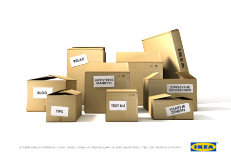
After the ‘welcome’ message we can see 7 boxes. Starting on the right the first one we see is ‘Stressvrije Oplossingen’ (Stress-Free Solutions), which is in fact a dressed-up ‘links’ page to product planners from IKEA such as their Kitchen Planner tool, the PAX Planner (where you can design your own dressing or closet), and so on. Nothing new here, just links to online services.
Next box is ‘Kaartje Zenden’ (Send an e-card), where you can send a digital piece of cardboard to your friends by using one of the six templates. Some of the slogans are average, others are more amusing, that’s just a matter of taste. The entire point is to spread the word to your friends/colleagues/etc about the Leefnu.be website. Nothing new here either.
Next box is ‘Test Nu’ (Test Now), where the visitor is presented with some questions and is invited to indicate his level of agreeing or disagreeing by sliding a paperclip over a ruler-ribbon. It’s just a basic test with 14 questions and the end result is an analysis of ‘the factors that are keeping you from enjoying your life’. Slick design, basic questions. Afterwards you can have a detailed analysis sent to you by submitting some personal details, if you want that.
Fourth box is the ‘Antistress Manifest’, the promotional blah-blah from IKEA where they explain why they think life is moving too fast, and how they picture the stress-free life they cherish so deeply. The five points in the manifesto are just marketing the product benefits of IKEA, so nothing new here either. It’s the obligatory sales pitch, dressed up in a nice text.
The 5th box is labeled ‘Relax’. Clicking the box triggers a full-screen black pop-up with a looped audio file of ‘the sound of waves crashing on the beach’. It’s the ‘Zen’ part of the site, however playing it on my laptop, the sound reminded me of standing next to a highway in the rain with a car that passes by every once in a while. Some seagulls would have been nice. I like the idea though. Probably need better speakers for this.
The sixth box is the ‘tips’ box. It’s a brief list of tips to make your everyday life a bit less stressy. Visitors are invited to click a link and send an email with their own tips. It’s not sure what’ll happen to them, they do not seem to become enclosed in the list. Perhaps in a later phase, as promised on the site.
The seventh box is a link to the ‘blog’. This is causing quite a stir in the Flemish blogosphere, because some people seem to take it personally. I think it’s quite silly to compare a simple campaign-blog to ‘the’ list Scoble and Israel put up in Naked Conversations. It’s ridiculous. Saying that ‘IKEA blogs’ and that they’ve started a corporate blog is wrong.
First of all you could have made that up by seeing the URL. If IKEA was starting a corporate blog, they would have done it on their main URL, not in a ‘/blog’ of a campaign site. If you can’t see the difference between a promo-site and a corporate blog, you’re obviously not into marketing. Yeah, I’ve seen the blog too, and yeah, the only thing showing is a list of selected press articles that relate to the general topic of the campaign. People are invited to share their opinion and discuss the articles. They’re not blogposts. Yeah, the engine is WordPress, because that’s the easiest way to set up a discussion platform on a short notice. Maybe there wasn’t a budget to start coding their own engine, and sure as hell, there wasn’t any time. What did you expect them to do? Start a wiki? Set up a forum? All this for a campaign that will run roughly a month?
I would have done exactly the same, and there’s nothing wrong with it. Okay, they use the word ‘blog’. Big deal. That’s how people call a website that lists articles and has a commenting function for feedback. They clearly state on the landing page in the campaign site (which you have to pass before you enter the blog) that they only ‘gather existing articles from the press’ about things that relate to the campaign, and that they invite visitors to drop a comment about them. They don’t say: “welcome to IKEA’s official corporate blog”. There’s nothing wrong with using WordPress to start up a discussion platform. Some people are getting over-excited from reading the word ‘blog’, and they think they know all about it. It’s like something snaps in their head when it turns out some agency ‘dares to use WordPress’ and publishes content they stole/copied/(paid for?) from the press. No, it’s not because you run a campaign ‘discussion platform’ (to not use the word ‘blog’) that you have to set up a quest for in-house bloggers. As you might have noticed, IKEA has a lot of floor-staff who run around like ants in the store, helping customers. They don’t have time to blog. And no, appointing a fulltime blogger for a temporary local campaign site isn’t the answer either.
Really.
Disclaimer: I bought an IKEA table once, but it didn’t last long, and the closet I have put together with my brother-in-law came with crooked doors.
