RSS
 

Archive for the ‘Advertising’ Category

Leica Ultravid

01 Aug 2006

These ads for Leica’s Ultravid binoculars have to promote the ultrasharp light weight & high performance of the product, and do so pretty well. I like the idea of the folded landscape between the outdoor dude and the animals, it’s really simple and yet so strong. I don’t remember having ever seen anything alike. It’s impressive, communicates the benefits clearly and I’m pretty sure the target audience knows exactly what the message is. I don’t carry around binoculars myself, and I’m not really an outdoor dude, but I can imagine you need a good strong binocular to truly enjoy ‘real nature’. Unfortunately, the agency is unknown.

Leica - Brown Bear

Leica - Polar Bear

Leica - Rhino

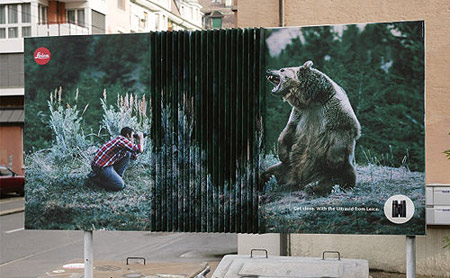
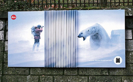
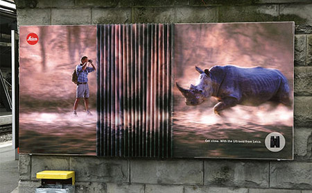
Copy: “Get close with the Ultravid from Leica” (I think)

Thanks, Bert


Good Fish Food

01 Aug 2006

Heheh. Sheer brilliance. An ad for fish food. Good fish food. Powerful fish food. The kind that makes your fish grow. I love it.

Lico Fish Food

Brand: Lico
Agency: Tonga Workroom
City, Country: Beijing, China
Via: 24


Beware Of The Ninja

01 Aug 2006

This ad is rather unfortunate. See, I love ninjas and their weapons. I really admire the art of slicing someone’s guts out with a sword so sharp that if it’s planted upside down in a river bed, it splits a leaf that floats against it (you’ll remember the scene from the movies). I know ninjas are fast as the wind and they can slice you into small sushi bits before you can blink with your eyes. But here’s the catch. For this PlayStation2 game, Cawley Nea/TBWA came up with the concept of the guy that brushes his teeth. So okay, he’s brushing his teeth and his head is whacked off so fast his body doesn’t seem to know it yet. The reflection in the mirror hasn’t gotten it either and still thinks there is something to reflect. So far so good. Now look in the sink. The way the head is positioned, with the white stuff in his mouth… does that look gay or what? I know it’s the toothpaste, but it seems like he just gave a blowjob. Don’t get me wrong here, it might be my twisted mind, but seriously… look at it. It’s so clean. No blood, no guts, no ninja. Just a guy standing in front of a head that’s placed with the mouth facing the zipper, and some white juice dripping from the mouth. Ew. Rather unfortunate indeed. What game was it they were advertising? I can’t remember.

PlayStation2

Found on TBlogWA


Hard To Be Original

31 Jul 2006

Hmm. JoeLaPompe has a point. And it’s a good one. It’s hard to come up with new ideas, sometimes. But I think it’s possible. You can’t tell nobody at Saatchi & Saatchi Poland knew about this. I mean, the first thing I do when I came up with an idea, is to go check if it’s been done before or not. And if it’s been done already, how much does mine look like it. Is it enough to be different? Are they too much alike? If so, rethink the concept. Especially when it’s in the same sector. There no shame in ‘adopting’ an idea or concept, as long as your own touch is clearly visible and the ad as a whole is not in the same line as the original. If you see these, and then note that the previous ads (from 1997 and 2002) are both finalists at really big contests… that means the agency of the third ad didn’t really do its research that good. Or is there a rule that says you can recycle an idea or concept altogether if there’s ‘x’ years between the last known execution and yours. What do you think?

Mercedes

Type: Mercedes-Benz Class-E
Year Of Execution: 1997
Source: One Show volume 19 – Print Finalist.
Creative: Jeff Ross
Art Director: Mark Wennecker
Agency: The Martin Agency – Richmond (USA)

Audi

Type: Audi Quattro
Year Of Execution: 2002
Source: New York Advertising Festival – Finalist.
Creative : Mirella Valentini
Art Director : Giovanni Policastro
Agency : Verba SRL (Milano Italia)

Toyota

Type: Toyota Land Cruiser
Year Of Execution: 2006
Source: http://www.garicruze.typepad.com/
Art Director: Bartek Grala
Creative: Daniel Piecka
Agency : Saatchi & Saatchi (Poland)


Wheelchair Anyone?

31 Jul 2006

Here’s another campaign for the GAR (Groupement pour l’action routière). Translated, GAR would be something like ‘the group for road action’. It’s a nonprofit organization that’s trying to raise awareness for the irresponsible behavior caused by speeding drivers, pointing to the results of their moronic conduct. The action is quite sophisticated, because they present a funeral wreath, an urn of ashes or a wheelchair, as if they were prizes you could win or bargain sales you could be eligible for if you drove at a certain speed and hit someone. Tough visuals. Nice work from Ogilvy.

If you were wondering why the urn starts at 129 km/h and the funeral wreath at 119km/h, it’s because the impact is so terrible at 129 km/h that a regular coffin is mostly out of the question. The ‘damage’ is too much. Think about it, the next time you’re driving.

Copy: for ‘Ashes’ : “starting from 129 km/h (80 mph)”
Copy: for ‘Wheelchair’ : “starting from 89 km/h (55 mph)”
Copy: for ‘Wreath’ : “starting from 119 km/h (74 mph)”

Client: GAR
Agency: Ogilvy Brussels
Account: A. de Terwangne
Creative Directors: Phil van Duynen, Koen Demaré
Copywriter: Koen Demaré
Art Director: Phil van Duynen
Photographer: Christophe Gilbert
Retouching: Yannick Lecoq
Media: Dailies (regional), Posters, tarpaulins at events


Oxy Cream

31 Jul 2006

These ads for Oxy are really amusing. If it’s hard to get rid of the nasty zits that refuse to ‘pop’, you’ll try the most crazy and stupidest things. I bet you could have a good laugh with yourself if you’d record your movements and saw them again, right on those private moments where you need both your hands, tilt your head in an impossible angle to keep looking in the mirror to then find out the little bugger decided to grow in a place that’s impossible to reach. Luckily there’s a cream that can solve it. Although (this might sound really gross) a cream doesn’t take away the satisfying feeling you have when you succeeded in ‘popping’ the pimple.

Oxy 1

Oxy 2

Copy: “When you’ve tried everything else”
Agency unknown | Thanks, Dave


Heinz

30 Jul 2006

There’s two things I like about these images. The fact that a tortoise and a snail are being used really illustrates just how long it takes for the ketchup to melt on hot toast or freshly baken fries. Next: I love it when the ketchup isn’t melting, especially on tasty food. These images look so yummy I could eat the food right away. And that’s exactly what Heinz is trying to say. “Don’t worry about the sauce, it’s thick, it’s going to stay where you’ve put it”.

Tortoise

Snail

Copy (top right corner): “Ultrathick”
Agency unknown | Thanks, Dave


HBO – Van Helsing

29 Jul 2006

I don’t know who made these ads, but I kind of liked them as soon as I saw them. They’ve been in my archive for half a year already. I’ve been looking for credits, but I didn’t find any. If you know who did this, feel free to comment. Otherwise, enjoy them like I did. :)

Singer

Storyteller

Nurse

Copy: “The Bad Are Turning Good – Van Helsing – 11 nov. 9PM – Only on HBO”