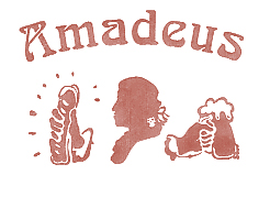
Arnaud sent me some logos of companies from around the world. Big deal, you’d say. I think these ones are ’special’. Either the designer was really pissed off and wanted to screw over the customer, or the sales rep is a very very good storyteller and convinced the client they would really work. I’m still undecided but I don’t think that any sane person would ever agree upon having his/her business being represented by an unfortunate logo as the ones below. What do you think?

1. Institute for Oriental languages
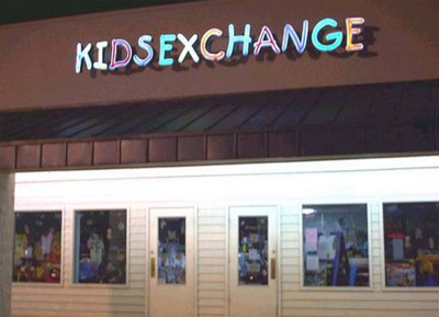
2. Kids furniture and clothing store
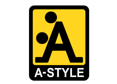
3. Italian fashion brand

4. A pediatric center
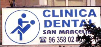
5. Dental clinic
6. Drugstore specialized in back injuries
7. Hot-Dog Boutique
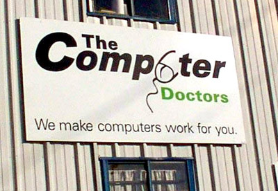
8. PC repair store
Thanks, Arns
…krautwiggla.de » Blog Archive » Na Logo!
November 9, 2007 at 11:36 am
[...] Sonst führt das zu Missverständnissen. [...]
Boskizzi
November 9, 2007 at 2:38 pm
Ehi, in Italy the A-Style brand is cool and very popular. I love it!!
roberto
November 11, 2007 at 4:16 pm
Regarding the A-style logo, the story is a bit different.
A guy thought up that logo and believing it had a potential, had hundreds of stickers printed with that image.
He proceeded to plaster traffic light with the stickers.
So in a relatively short time, the logo / brand had a pretty high awareness. Pity is, no0 products were associated with the brand… until finally a company producing street wear bought the logo…
So things were done, for oce, in the reverse order
wayfinder
November 11, 2007 at 10:36 pm
I found another good one last year (click my name to see it)
Werbetechnische Fettnäpfchen » Huwis Achterbahn durchs Leben
November 14, 2007 at 7:47 am
[...] Acht wunderbare Entgleisungen beim Logo-Design hat Coolz0r zusammengetragen. Ebenso witzig sind die “schlecht platzierten” Werbungen, welche bei oddee.com zu entdecken sind. [...]
Gut, dass… « Wumpe
November 14, 2007 at 8:17 pm
[...] Gut, dass… … nicht immer alles so eindeutig ist: Klick mich! [...]
Unvorteilhafte Logos at THECRAZED
November 15, 2007 at 11:53 pm
[...] 8 der Logos, kann man HIER sehn, ein wirkliches MUSS [...]
links for 2007-10-28 at blog.forret.com
November 16, 2007 at 2:35 pm
[...] – Coolz0r – Marketing Thoughts » 8 Unfortunate Logos I don’t think that any sane person would ever agree upon having his/her business being [...]
Wochenendbeilage | REDUXO
November 16, 2007 at 6:11 pm
[...] Logos, die “unglücklich” umgesetzt wurden. Sonst kann das leicht zu Missverständnissen [...]
Eindeutig zweideutige Logos - Bastie&Silke
November 17, 2007 at 7:34 pm
[...] “momworx” wurd ich auf diesen Artikel mit den eindeutig zweideutigen Logos aufmerksam. Man kann sich wirklich fragen ob das Gehirn gern bestimmte schmutzige Dinge in den [...]
» Gestalterische Fehltritte
November 18, 2007 at 6:27 pm
[...] davon gibts hier! Tags: Tags: Design, [...]
WEEKEND TRIVIA - of dubious brand names « MADVERTISING
November 18, 2007 at 9:04 pm
[...] over at WERBEBLOGGER has more unfavorable logos. [...]
8 Misslungene Logos - Manuel’s Blog
November 20, 2007 at 11:57 am
[...] CoolzOr Der Beitrag wurde am 20. November 2007 um 11:52 von Manuel veröffentlicht. Dieser wurde der [...]
» Blog Archiv » Any friday: message from Julio about future
November 23, 2007 at 7:11 pm
[...] What’s wrong with these logos? [...]
Achtung, wir verlassen (wieder einmal - egal) das tiefere Fahrwasser « virtual cyber plumbers inc.
November 25, 2007 at 3:51 pm
[...] November 2007 in uncategorized by nille Bei diesen Logos hätten die Designer vielleicht besser vorher eine zweite Meinung eingeholt [...]
ein bisschen Amsterdam in Peking « SOJAHUND - China aus den Augen eines vegetarischen Werbers
November 26, 2007 at 4:38 pm
[...] 8 solche Schmückstücke findet Ihr bei coolz0r. (via °flo@MADVERTISING & Patrick@Werbeblogger) [...]
Basic Thinking Blog | Logos: leicht missverständlich
November 27, 2007 at 7:18 pm
[...] sind nicht so ganz eindeutig, wie es sich wohl der Logodesigner ursprünglich gedacht hat, zB weitere Logos (eins davon ist tatsächlich bewusst provokativ [...]
Kuba
November 27, 2007 at 8:06 pm
i dont understand that. the people who do this logos should have see that they are a bit ambiguous. strange.
The Logger » Blog Archiv » Es gibt schon
November 27, 2007 at 9:07 pm
[...] Knochen und ich meine damit bestimmt nicht das 6110 Nav. Und nun ganz ehrlich ich finde die Logos hier total abgefahren. Teile und genieße Diese Icons verzweigen auf soziale Netzwerke bei denen [...]
Amüsante Logos « zeitklinke
November 27, 2007 at 11:11 pm
[...] November 2007 Eine Reihe recht amüsanter Logos habe ich gerade bei Robert Basic entdeckt. Auf jeden Fall sehenswert und [...]
Kid Sex Change | zerfall.com - Finale Weisheit, Berichterstattung.
November 28, 2007 at 12:12 am
[...] Ahung ob die Logos hier bewusst provokant formuliert worden sind oder nicht, aber unterhaltsam auf jeden [...]
Tim Sahling Online - Blog » Blog Archiv » Missverständliche Logos
November 28, 2007 at 8:12 am
[...] dem Marketingblog von Coolz0r gibt es eine nette Sammlung von einigen unglücklich oder teilweise auch absichtlich provokativ gestalteten Logos, die oftmals [...]
Zweideutige Logos « reality2
November 28, 2007 at 8:45 am
[...] *Klickz0r* [...]
BBlog » Blog Archiv » Logos - unglücklich gewählt
November 28, 2007 at 1:11 pm
[...] Coolz0r – Marketing Thoughts » 8 Unfortunate Logos [...]
BlogSprache.de >> » Zeig mir dein Logo…
November 28, 2007 at 5:53 pm
[...] ist nur eins von sieben, meiner Meinung nach ziemlich provokativ gewählten Logos, die ihr bei Coolz0r finden könnt. Mal ehrlich, ich kann doch keinen Kinderladen so nennen? Das schießt nem [...]
Unglücklich gewählte Logos » Lemix
December 1, 2007 at 7:19 pm
[...] Logos von dieser Sorte findet man bei Coolz0r Weitere Blogs zu diesem [...]
Wochenrückblick 48/07 | schweizweit.net
December 2, 2007 at 2:23 pm
[...] Zweideutige Firmenlogos [...]
chio
December 2, 2007 at 2:36 pm
Super, die Liste.
Die Leute (Auftraggeber, Graphiker, Designer) sind oft völlig betriebsblind – und sehen es einfach nicht. Natürlich merken sie es dann doch irgendwann, aber dann ist das Briefpapier schon gedruckt und das Schild hängt oben. Und dann lebt man halt damit.
Bei Kidsexchange dürfte aber nur das ’s’ etwas verdreht sein. Wenn es leicht gegen UZS gedreht wäre würde das schon wieder anders aussehen.
Constantin
December 2, 2007 at 8:23 pm
Nice Logos!
In my opinion the third one is the best of the list!
Constantin
Matthias
December 4, 2007 at 9:33 pm
You should definately add this one to your collection. Trucks with this logo can be seen quite frequently on German Speedways…
http://rameder.de/
Basher
December 6, 2007 at 4:40 pm
Haha… Verrry funny even in finland
Designer » timo-ernst.net
January 4, 2008 at 9:29 pm
[...] gibt es übrigens mehr auf coolz0rz.com « Ja, ich bin raus aus dem StudiVZ | [...]
Joe
February 7, 2008 at 10:47 pm
LOL. Are the People so stupid that they dont see that wo do?
Coolz0r - Marketing Thoughts » 1 Unfortunate Logo
February 8, 2008 at 7:41 pm
[...] few months ago I did a post about 8 unfortunate company logos. Recently I came across another logo that really could fit in well with the others. I’m not [...]
Dale from Michigan
February 20, 2008 at 4:12 pm
I do not get the interest in th A style one. What am I missing?
8 nichtgelungene Logos | dacblog
February 29, 2008 at 11:27 am
[...] Coolz0r-Blog wurden acht Logos zusammengetragen mit Emblemen die ungewollt etwas anderes bedeuten [...]
mark
March 8, 2008 at 10:28 am
computer doctor also kinda looks like spermtail swimming up someone’s butt.
A-style should be renamed D-style.
8 logos desafortunados « Fuego Azul
April 9, 2008 at 7:16 pm
[...] Cool Marketing Thoughts me entero de que hay empresas de todo el mundo, que dise�an sus logotipos de una forma poco com�n [...]
Logotipos desafortunados « Todo Interesante
April 21, 2008 at 2:23 am
[...] Fuente Filed under: Insólito | Tags: diseñadores, diseños de logotipos, kids, logotipos, los mejores logotipos, los peores logotipos, sex logos [...]
Dumme Firmenlogos und Kloschilder II | Webzy.de
April 28, 2008 at 5:50 pm
[...] herauskommt, wenn man es um 90° dreht. Aber sie sind wenigstens in guter Gesellschaft, denn anderen Firmen ist ähnliches passiert. Bei diesen Kloschildern wüsste ich aber auch nicht, ob man es im besoffenen Zustand noch schafft [...]
22 of The Funniest Search Marketing Posts - KoMarketing Associates
April 30, 2008 at 2:06 pm
[...] 8 Unfortunate Logos Ok this just makes me laugh but is a little inappropriate. You’ll have to see for yourself! [...]
mmonk
August 26, 2008 at 7:04 am
these are just wrong…
Craig Watson
September 13, 2008 at 7:40 pm
Being in the logo business, I find this extremely interesting. One has to have a very creative but discrete eye when creating a logo. It is always a good idea to look at ones ad from a different perspective just to make sure someone else does not.
Jeremy Tuber
May 8, 2009 at 3:39 pm
Yet further proof for designers that you should always have a second pair of eyes check over your work before sending it out.
Although I’ve gotta say, some of these look intentional…which might not be a bad idea if you’re trying to attract attention.
@JeremyTuber
beingastarvingartistsucks.com