Arnaud sent me some logos of companies from around the world. Big deal, you’d say. I think these ones are ’special’. Either the designer was really pissed off and wanted to screw over the customer, or the sales rep is a very very good storyteller and convinced the client they would really work. I’m still undecided but I don’t think that any sane person would ever agree upon having his/her business being represented by an unfortunate logo as the ones below. What do you think?

1. Institute for Oriental languages
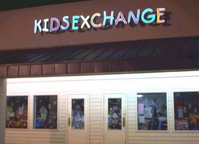
2. Kids furniture and clothing store
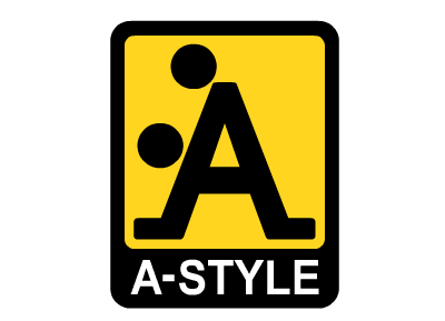
3. Italian fashion brand

4. A pediatric center
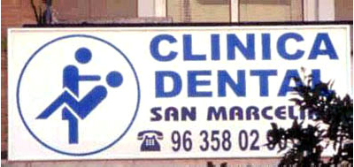
5. Dental clinic
6. Drugstore specialized in back injuries
7. Hot-Dog Boutique
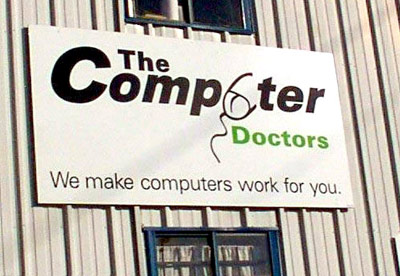
8. PC repair store
Thanks, Arns
Manuele De Lisio
October 27, 2007 at 11:29 am
Well, I wouldn’t call the A-Style logo “unfortunate”, it’s meant be THAT, it’s fun and quite popular in Italy among teenagers.
Coolz0r
October 27, 2007 at 12:14 pm
I agree it’s meant to be provocative. For a minute I forgot it’s actually a street brand and like a lot of skate-style or board-style brands, indeed they are meant to be this way. Though it fits in pretty well with the others. But you’re right. It’s popular just because the suggestive picto.
Logos desafortunados
October 28, 2007 at 4:35 pm
[...] Fuente: CoolzOr [...]
Logos desafortunados
October 28, 2007 at 5:24 pm
[...] Fuente: CoolzOr [...]
PaulRubillo.com » Blog Archive » Eight Logos You Can’t Believe
October 28, 2007 at 9:16 pm
[...] Click here for the logos [...]
Colurz Blog » Logodesign - unglückliche Beispiele
October 29, 2007 at 7:26 am
[...] designen ist eben doch sehr viel schwerer als man glaubt. Wer es nicht glaubt, der kann sich ja mal diese 8 Logos anschauen, die auf CoolzOr veröffentlicht wurden. Der Begriff “unglücklich” ist doch [...]
Gery
October 29, 2007 at 10:05 am
Ich kann nur lachen, diese Logos haben das Thema “Bildsprache” aber richtig verfehlt! :)
e-Mino
October 29, 2007 at 1:08 pm
And yet another referral to this post. Keep up the good work !
Pierre
October 29, 2007 at 2:38 pm
Kid sex change!!!
It’s freaking genius…
Newton Calegari
October 29, 2007 at 7:47 pm
Hi,
Fiz uma referencia do seu post lá no meu blog! ;)
Abraço
:: littleoslo :: S » Blog Archive » 八个引人遐想的商标设计
October 29, 2007 at 9:46 pm
[...] source: Coolz0r – Marketing Thoughts [...]
:: littleoslo :: E » Blog Archive » Prank design, Pervert logo
October 29, 2007 at 9:49 pm
[...] Coolz0r – Marketing Thoughts Share and Enjoy:These icons link to social bookmarking sites where readers can share and discover [...]
spike
October 30, 2007 at 9:45 pm
I’ve looked again and again at the A-Style logo and really don’t see the joke.
I squinted at it, turned it up the other way, and well, nope. I just don’t get it.
SEO ROI
October 30, 2007 at 9:52 pm
Funny, I was just thinking of something like this. I saw the Department of Nuclear Medicine at my hospital and was like this has potential!
Coolz0r
October 30, 2007 at 11:07 pm
It’s a couple of people doing it doggy style, spike :-)
I’ll leave the gender up to you to decide…
Manish
October 31, 2007 at 12:47 am
Only i want say that these logos funny may not Unfortunate.
Todd
October 31, 2007 at 6:24 am
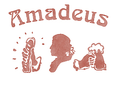
That Amadeus logo is very disturbing. : >
Gunjan
October 31, 2007 at 7:39 am
It is very creative logos. Great
Kimota
October 31, 2007 at 7:50 am
If the object of the marketing campaign was to get the business branding out and noticed in the world, then they achieved their aim. For me the most ludicrous was the Computer Doctor with the penis mouse. How they didn’t see that, I have no idea. But they got publicity because of it!
logá so sexuálnym podtónom | brandblog.eu
October 31, 2007 at 1:24 pm
[...] via Prečítaj si podobné články typografia komunizmu I. [...]
Sand & Cotton » Unfortunate Company Logos
October 31, 2007 at 7:09 pm
[...] Unfortunate Company Logos ADD THIS POST TO: Posted by stephen | Filed in 1sideblog [...]
yaph
November 1, 2007 at 10:48 am
The logo of the pediatric center is more than unfortunate. Who would trust them and let them take care of their child?
The other logos are quite funny and I can imagine that A-Style is very popular.
Random Forest
November 2, 2007 at 12:22 am
I think the eBay one is the funniest.
Lustige Logos
November 5, 2007 at 12:03 am
[...] Fehlleistungen, bei denen die eigentliche Intention des Gestalters unfreiwillig zutage tritt. 8 Unfortunate Logos zum Schmunzeln. [...]
Marcus
November 5, 2007 at 10:43 am
Great Collection !! :-))
stefano picco
November 5, 2007 at 11:36 am
very cool ;D
iRaff » Blog Archive » Logo-Gestaltung die in die Hosen ging
November 5, 2007 at 12:35 pm
[...] » Blog CoolzOr [...]
Freudsche (Logo-)Fehler « Der Dicke Blog 2.0
November 5, 2007 at 2:30 pm
[...] an unerwünscht doppeldeutigen Logos entdeckt, die “8 Unfortunate Logos” werden auf coolsOr – marketing thoughts präsentiert. Teilweiße zum totlachen komisch, teilweise unvorstellbar, dass sowas nicht [...]
Blog-abfertigung: Blogger aus der Frankenmetropole Nürnberg
November 5, 2007 at 3:32 pm
[...] Unfortunate Logos [...]
The oakdiary BLOAK. Now with even more bloak! » heißt ja auch nicht …”Meister Popper”
November 5, 2007 at 5:45 pm
[...] Unglückliche Logos [...]
Logo-Design: 8 seltsame Entgleisungen || Pixelgalerie Weblog
November 6, 2007 at 9:10 am
[...] 8 Unfortunate Logos zeigen auf lustige Weise einige Entgleisungen im Logo-Design. Die Bezeichnung [...]
Oliver Timmermann, Griesheim » 8 unglückliche Logos
November 6, 2007 at 10:45 am
[...] machen sich bei der Logogestaltung offenbar wenig Gedanken. Eine kleine Sammlung findet man hier: 8 unfortunate logos. Die Seite ist zwar auf Englisch, aber die Bildinhalte dürften auch einem fremdsprachigen [...]
lautleben.com
November 6, 2007 at 11:10 am
[...] 8 Unfortuate Logos >>> [...]
Werbeblogger Schnellschuss - Unser täglich Link » Blog Archiv » Logos, die ins Klo greifen
November 6, 2007 at 2:14 pm
[...] Bei diesen Logos wurde ordentlich daneben gelangt. Danke an André für den Tipp per Mail. Tags: doppeldeutigkeit, humor, logos Ähnliche Artikel: [...]
Ungewollt perverse Logos at Dave’s Blog
November 6, 2007 at 6:56 pm
[...] Das muss man einfach gesehen haben [...]
Logos desafortunados o mentes sucias
November 6, 2007 at 7:30 pm
[...] Más casos en Coolzor [...]
Claudia Meier
November 6, 2007 at 7:46 pm
well I atually like the dental Clinic one, it´s kind of funny (:-
blogsurdum :: flatulenzen im digitalen grundrauschen
November 7, 2007 at 2:27 am
[...] →hier gibts noch ein paar weitere nicht ganz so glücklich gewählte logos… [...]
Stallgeflüster » Blog Archiv » Logo Design - Ich sehe was, was Du nicht siehst…
November 7, 2007 at 9:33 am
[...] Coolz0r – Marketing Thoughts » 8 Unfortunate Logos [...]
LautundKlar Webdesign Blog » Zweideutige Firmenlogos
November 7, 2007 at 10:17 am
[...] Hier haben wir eine nette Zusammenstellung eindeutig zweideutiger Firmenlogos: [...]
RC
November 7, 2007 at 2:28 pm
I didnt get the joke in the A style logo. Whats so unfortunate about that? The two balls?
En attendant la première commande at MancheCourte.com
November 7, 2007 at 5:19 pm
[...] Et pour ce qui est du problème de logo dont Chris vous a parlé, je me console en me disant qu’on aurait pû être pire! [...]
Peter
November 7, 2007 at 5:22 pm
The Pediatric Center’s logo is very insinuating and disturbing -
It’s overtly a small child being drawn to the
sex of the adult person – completely inappropriate.
I’d categorically reject them for my own children.
Dana Loewy
November 7, 2007 at 11:09 pm
I teach Business Communication and I would LOVE to share these unfortunate yet oh-so-funny logos with my students. Alas, academic freedom takes a backseat to political correctness and our crazy HR people. No sex in the workplace, period. No touching, no double entendre, either. All that could be interpreted as “hostile work environment” because someone could be offended by sexually explicit material.
Which means that I can’t show these logos to my kids although the pics say so much about (mis)communication. I will just share them with my colleagues although, technically, I’m not even supposed to do THAT! Yes, this tells you something about the sad state of academia and, worse yet, the workplace in the United States.
Dan
November 8, 2007 at 2:16 am
This is the reasin why you should hire a professional and not try to do it yourself.
Dailylife @ turtelina.net » The Ultimative Pluggie Post
November 8, 2007 at 12:03 pm
[...] 8 Unfortunate Logos, oopsie. [...]
» Logo-Gestaltung: “créateur d’logo” - eine zynische Zunft? » Blog-Onlinemarketing
November 8, 2007 at 1:15 pm
[...] sich die sehr anschaulichen (und für die Bauchmusklen angenehm anstrengenden) Ergebnisse auf Coolz0r – Marketing Thoughts [...]
Kommunikationsdesigner
November 8, 2007 at 3:10 pm
Irgendwie glaub ich nicht das da alles so unfreiwillig passiert ist. Nicht destotrotz eine traumhafte Liste..
» 轻松一下:非常不幸的八个LOGO SERPS.CN: 致力于英文SEO
November 8, 2007 at 3:48 pm
[...] 本文转载自这里 [...]
Au dehn zaan gefyllt… « Didi Dodo Dada Block
November 8, 2007 at 6:21 pm
[...] CLINICAL DENTAL CON COITUS! funnDenn bey coolz0r [...]