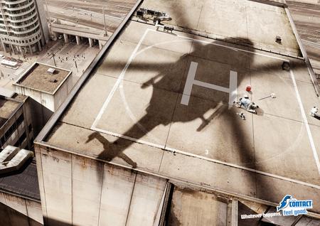
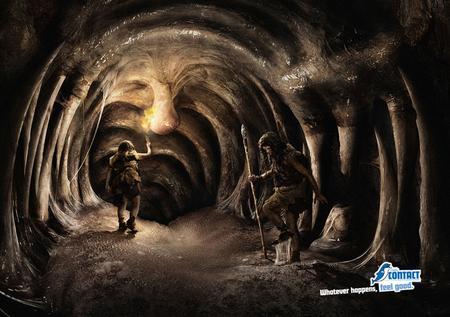
These ads for the Belgian radio station ‘Radio Contact’ are pretty funny, although I don’t really think they bring the message across that good. What I interpret from these visuals is that you should keep feeling good, even though the situation is looking kinda ‘f*cked’, and you’re probably not really going to survive in the same healthy condition as you were before. I hope the visuals are just meant to be humorous, because frankly, the last thing I want to do in situations as these is relax, sit back and listen to the radio. Obviously. But the approach is non-traditional, and I like that. The tongue-in-cheek thing, you know. I really like the drawing of the cavemen inside the dinosaur. I bet they wished they had music back then :) The dentist is totally off the hook, I don’t really like that one, but the guy painting the ‘H’ for the chopper on the roof, well… he’s just genuinely screwed. Hah!
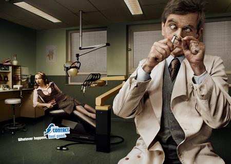
Copy:”Whatever happens, feel good – Radio Contact”
Agency: Leo Burnett
Account Team: Rodolphe Coonen, Lise Gausset
Creative Directors: Jean-Paul Lefebvre, Michel De Lauw
Copywriter: Gregory Ginterdaele
Art Director: Marie-Laure Cliquennois
Photographer: Marc Paeps
Retouching: beefactory
Media: Magazines, dailies
Dean
January 23, 2007 at 12:18 am
Those are interesting pictures, but I just don’t get it. I don’t understand how any of those have to do with their tagline, “Whatever happens, feel good”. If the radio was on and the patient was smiling while her teeth were being pulled out, that would make sense. These? Not so much.
Coolz0r
January 23, 2007 at 1:42 am
I totally agree with you Dean. None of the images have any link to the radio station. Perhaps that is exactly the strategy behind this campaign. As weird as that might seem.
JP
January 23, 2007 at 12:32 pm
I must agree with you guys that the pictures and tagline in this campaign have no link what so ever with the station. It’s quite obvious that they try to pull the card of humour here. It seems like they focussed so hard on the link between the tagline and the pictures that they forgot to link the whole with the radio station itself.
Still, those images remain funny though :)