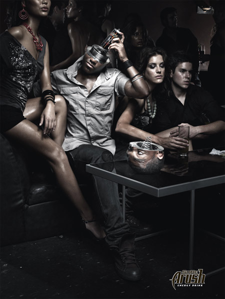
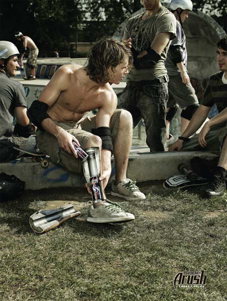
I love the way they pictured the drink as a battery in these ads. It points out very well what exactly they want you to use it for: if you’ve ran out of power and need a new shot of energy. It’s so simple, and so obvious, but I don’t think anyone else in the segment ever pictured it this way. (At least not to my knowledge) – Sort of reminds me of Terminator or something robotistic of that kind. I don’t know why, but it does. Nice artwork.
Copy: “SoBe Arush – Energy Drink”
Agency: BBDO Toronto
Creative Director: Ian Mackellar
Art Director: Mark Mason
Copywriter: Patrick Scissons
Photographer: Mark Zibert
Via: SeaSpace
albeenah
August 25, 2006 at 10:53 am
It’s quite an obvious, logical connection to make…I tried pitching a “neon light” idea to some clients for another energy drink :D
Coolz0r
August 25, 2006 at 11:39 am
The strength of an idea is to make it seem so obvious that everybody think: “of course”. The hard part is to make the visual strong enough and appealing, not to mention to come up with this idea. :) Very often the more logical an idea ‘looks like’ the harder it was to get to it.
balraj banger
November 3, 2006 at 3:28 am
hi,
this is in reference to both pictures. technically both are wrong because conventionaly the positive terminal of the cell always touches a strip and the negative terminal is pushed by a spring. but in your pictures it is reverse.
i have written it because, this is something standard, one’s eyes are habitaul of watching it in every walk of day to day life. not following the standard, sends a wrong signal to the would be consumer. it also sends wrong signal about your cretivity.
hope you will take in a positive way.
have a good day.
balraj banger
Coolz0r
November 3, 2006 at 11:33 am
Thanks for pointing it out balraj, but I didn’t create them :) Though it’s good to see someone took the effort of analysing what is being shown. Really appreciate that.