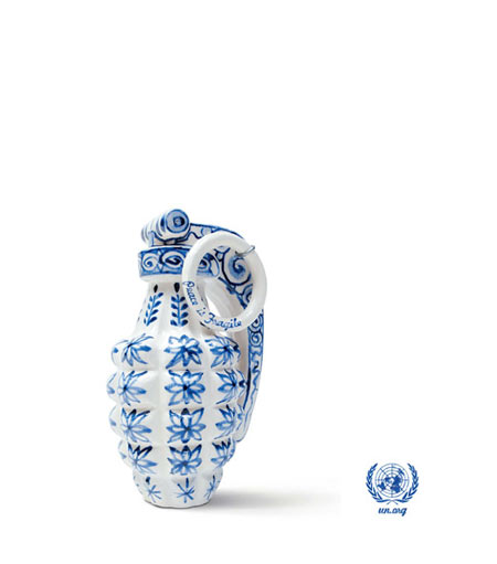
This ad for the United Nations is pretty simple and damn strong at the same time. The copy “peace is fragile” combined with the grenade that looks like a Chinese vase from expensive porcelain has a triple meaning. On the one hand, peace is fragile, on the other hand peace is expensive. (damn there’s only two hands…, hard to make a three-way point *switching limbs*) and on the one foot, peace is explosive. Nicely put.
Agency: Saatchi & Saatchi, Sydney
Creative Director: Nobby
Copywriters: Jason Mendes/Steve Jackson
Art Directors: Steve Carlin/Pete Buckley
Photographer: Ken Wagner
Typographer: Nic Buckingham
Artist: Charless Kraft
Via: AdsOfTheWorld

iphi
July 24, 2006 at 11:01 pm
And maybe you can give him some credit too, the original artist of the grenade is Charless Kraft who has fabricated a large arsenal of porselain weapons (‘the porselain war museum project’). Even a windmill that looks like a swastika if I remember correctly. If he ever makes an AK-47, I’ll be bidding on that one. =d