Here are some cool elevator ads, all found on BriefBlog. The McDonalds ad shows little inspiration, compared to the one of KillBill and Superman Returns. I think they could’ve done a lot more with the concept than this simple execution, but I wasn’t hired for the job so I’ll just nag about it from behind my PC :) The Superman Returns ad is pretty cool, but the one from KillBill is by far the best, in my humble opinion.
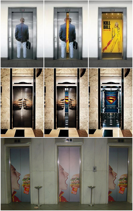
As you can see by comparison, the last one is truly the worst. How does this make sense? It’s a simple ad, could’ve been displayed in a magazine or on the paper you see on your plate in the McDonalds restaurant, but now it’s on this elevator door. It doesn’t interact with the environment it’s been placed in. The burger comes to the face and that’s it. It’s too simple. Very often when you see an idea that’s simple, it can be a great and unique idea. But all the other times when you see a simple idea, it’s just plain old simple and nothing original or daring. That’s what we have here. Too simple to be good. Especially compare to the other two examples, where the action is continued inside the elevator. The brand interaction (or in this case ‘movie interaction’) is extended, which makes the experience more remarkable.
octave
July 2, 2007 at 1:27 pm
Hi, the problem with the Mc Do’s ad is that you don’t have the picture of the elevator’s inside. So you have just a part of the ad.