RSS
 

Archive for June, 2006

Lego Singapore

26 Jun 2006

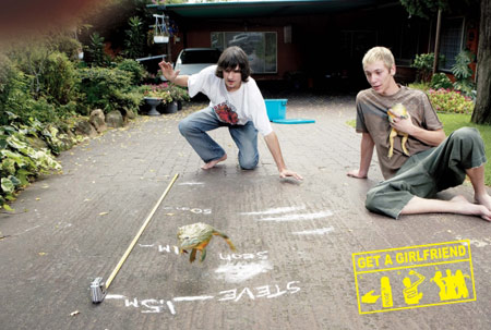
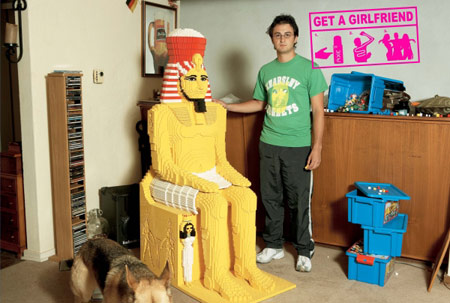
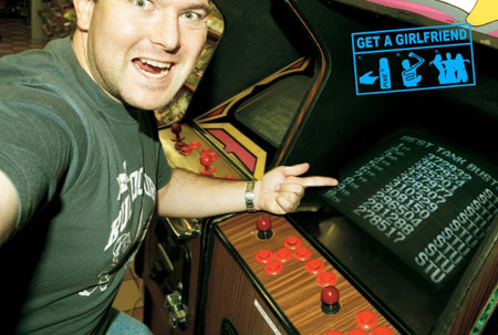
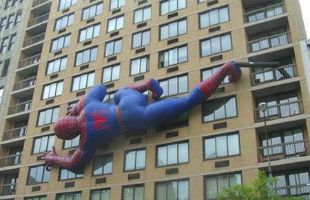
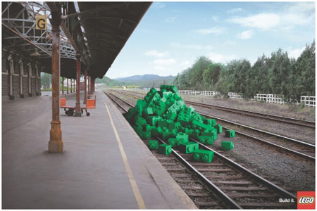
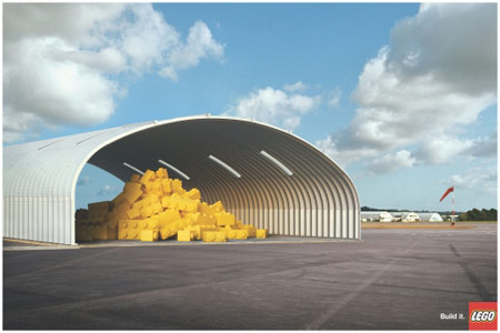
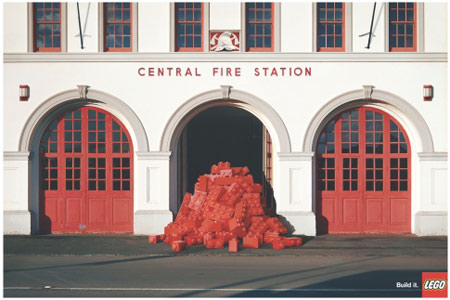
Really nice edited images for Lego Singapore. Very strong, very creative. They really make you imagine and dream. The copy for these ads is ‘build it’ instead of the ‘imagine’ they used in the Periscope/submarine ad that won the grand prix (which I blogged earlier). I like the commanding tone that is set with the slogans. It’s almost compulsive for the readers to start doing what they tell you to do, without making it seem as an obligation. It’s more like a really stressed advice. It’s a pushing invitation to start using your imagination. Be creative. Think Lego. (Awarded with a Silver Lion in the Press category)

Train-Station

Hangar

Fire-Station

Type Of Advertisement: Magazine
Category: Entertainment & Leisure
Advertiser: Lego Singapore
Product or Service: Lego
Advertising Agency: Saatchi & Saatchi Singapore
Country: Singapore
Creative Director: Andy Greenaway
Copywriter: Stuart Harricks/Roger Makak
Art Director: Stuart Harricks
Photographer: Dean Zillwood/Idc Photographers Nz.
Account Supervisor: Jun Shea
Advertiser’s Supervisor: Melissa Lim
Other Credits: Di: Procolor


Axe Silver Lions

26 Jun 2006

These ads for the ‘Get a Girlfriend’ campaign received Silver in the Press category in Cannes. I like the entire concept of this campaign. It has a decent storyline and the fact that in the end they released the video where the AXE Dude actually got a girlfriend makes this as a whole a beautiful campaign. It just adds up to the entire strategy AXE uses, and it’s proven to be a decent and working model. Really. I love it. I love the brand and the communication. It’s perfect. Plain and simple.

Frog Jump

Lego

Arcade

Scout

Type Of Advertisement: Newspaper and Magazine
Category: Cosmetics & Beauty
Advertiser: Unilever SA Home & Personal Care
Product or Service: AXE Deodorant
Advertising Agency, City: Lowe Bull, Johannesburg
Country: South Africa
Creative Director: Gareth Lessing/Rob Mclennan
Copywriter: Matthew Brink
Art Director: Adam Livesey
Photographer: Clive Stewart
Typographer: Adam Livesey
Account Supervisor: Kate Hill
Advertiser’s Supervisor: Lynn Madeley


FJaX: Flash Meets AJaX

26 Jun 2006

Very interesting article on the how and why of FJaX, which is worth reading if you’re into new developments:

Jay McDonald: The secret is that it’s using Flash (the “F” in Fjax) to act as a speedy little XML parsing engine, instead of handling all of that in JavaScript. But Fjax’s use of Flash is a pretty significant departure from how Flash has historically been used. In fact, this is a critical point — because Fjax isn’t geared specifically at Flash developers who are used to building things where the user interface is Flash. It’s really a whole new way of using Flash that will appeal to folks who are not “Flash people” and don’t want to make a “Flash site.”

The approach can be characterized like this: try to go to the Fjax site and point to the Flash. You can’t. It’s not visible anywhere. That’s completely different than how people are used to using Flash.

Read more at WebMonkey


Giant Spiderman

26 Jun 2006

Take a look at this giant spiderman outdoor. At the right foot you can see the tube through which the air is being blown into the big (plastic?) puppet. Pretty amazing isn’t it? I wonder what it’s for. Don’t know the location or agency (organisation) behind it, but it’s damn impressive and a real eye-catcher.

Giant Spiderman
 

Noble Objects Reverse Psychology

25 Jun 2006

These are the last ads from the Bronze Lions for Press I’ll post from this year’s Cannes event. The rest has already been posted here or isn’t quite my flavor. This campaign for Noble Objects, is ‘made in Belgium’ and promotes antiquities (an antique boutique in Antwerp, to be more exact). What’s really remarkable here is the reverse ’sales price tag’ they used. Normally the highest price is striked through and the lower promotional price is marked in red. In this case, to stress the fact that it’s about real antiquities, they reversed this common sales strategy and marked the highest price in red, whilst striking through the lower price. So simple, so powerful and adorably clever.

Noble Objects - Table

Noble Objects - Chair

Noble Objects - Pillar

Type Of Advertisement: Magazine
Category: Home Appliances & Furnishings
Advertiser: Noble Objects
Product or Service: Antiquities
Advertising Agency: Duval Guillaume Brussels
Country: Belgium
Creative Director: Peter Ampe/Katrien Bottez
Copywriter: Peter Ampe
Art Director: Katrien Bottez
Photographer: René Uyttebroeck
Account Supervisor: Isabel Peeters
Advertiser’s Supervisor: Geert De Bruycker


Legends Condoms

25 Jun 2006

Hmm. These are kind of spooky. From Sydney, Australia, come these three ads for Legend Condoms. What we see here is ‘future life’ if you don’t protect yourself. The kids are behind the strong rubber wall of the condom, eager to escape. Although I like the angle, the images have something morbid. It almost looks like a scene from a horror movie. Perhaps this is what the creatives tried to communicate as a message? If you’re not prepared, your life can turn into a hell? I think that it’s a cliché for condom ads to focus on the noise kids can produce. The copy says: “Protect yourself”. Award: Bronze Lion in the Press category.

Legends Condoms - Girl

Legends Condoms - Twins

Legends Condoms - Bear

Type Of Advertisement: Magazine
Category: OTC Pharmacy
Advertiser: Legends Condoms
Product or Service: Condoms
Advertising Agency: Clemenger BBDO Sydney
Country: Australia
Creative Director: Danny Searle
Copywriter: Robbie Brammall
Art Director: Ant Hatton
Photographer: Jimmy Fok
Typographer: Louis Huosien
Account Supervisor: Marianne Bess
Advertiser’s Supervisor: Daniel Moeschinger


Smart Reinforced

25 Jun 2006

I don’t quite get this campaign. The copy says ‘Reinforced steel structure in the whole range’ and it promotes the new and improved SMART car. We might suppose that the car became stronger, but I’m not really sure it’s a good thing to make it look like you’re invincible now. I don’t think this campaign brings the message the way it should have, but I like the sponge cow, stones and lorry. That’s kind of cute. Maybe those three items are the most common thing you can bump in to in Spain, where the campaign ran. Still, … I’m not really convinced this is strong enough to have been awarded a Bronze Lion.

Cow

Stones

Lorry

Type Of Advertisement: Newspaper
Category: Cars
Advertiser: DaimlerChrysler – SMART
Product or Service: SMART Car
Advertising Agency, City: Contrapunto, Madrid
Country: Spain
Creative Director: Antonio Montero/Jose Mª Cornejo/Fernando Galindo
Copywriter: Mikel Etxeberria
Art Director: Leandro Cacioli
Account Supervisor: Eva Mª Alvarez
Advertiser’s Supervisor: Jaime Olalquiaga


National Geographic

25 Jun 2006

These three ads for National Geographic’s Kids Magazine are pretty funny and inspiring. Kids and science… that’s always an interesting angle. I’m particularly fond of the ‘Space’ ad where the kid on the tricycle tied himself with a rope to the rocket that’s about to be launched. That one really made me laugh. The one with the zebras is a bit of a bummer, because I don’t think it’s as strong as the other two. But this is a really nice campaign. I totally understand why it got an award. Really creative and absolutely funny to look at.

National Geographic Kids Magazine - Space

National Geographic Kids Magazine - Lions

National Geographic Kids Magazine - Avalanche

Type Of Advertisement: Magazine
Category: Publications & Media
Advertiser: 8 INK Media
Product or Service: National Geographic Kids Magazine
Advertising Agency, City: FOX P2, Cape Town
Country: South Africa
Creative Director: Andrew Whitehouse/Justin Gomes/Noel Cottrell
Copywriter: Justin Gomes
Art Director: Andrew Whitehouse
Photographer: Stock/Rotem Shachar/B. Fasani
Typographer: Andrew Whitehouse
Account Supervisor: Daniel Hawkins/Dominic Slade
Advertiser’s Supervisor: Tammy Lederle